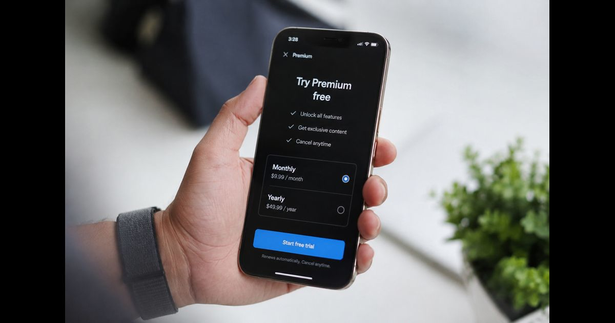
Dark patterns examples in apps include a free trial that quietly becomes a paid subscription, a bright “Allow” button beside a barely visible refusal option, an extra product added at checkout, and a cancellation path buried behind several screens. Each design changes the choice environment so the app benefits when a user overlooks information, taps by habit, becomes tired of refusing, or cannot find the way out.
Not every persuasive interface is a dark pattern. A clear recommendation, useful default, or genuine reminder can help people decide. The warning sign is an imbalance: the app makes its preferred action easy and attractive while making the user-protective action confusing, costly, slow, or difficult to reverse.
Dark Patterns at a Glance
|
Pattern |
Typical app example |
Main risk |
|
Visual interference |
“Continue” dominates while “Not now” is faint |
Unintended consent or purchase |
|
Confirmshaming |
The decline option insults or pressures the user |
Emotionally coerced choice |
|
Trick wording |
A double negative reverses the apparent meaning |
Accidental opt-in |
|
Preselection |
Tracking, add-ons, or renewal are enabled by default |
Data sharing or extra cost |
|
Forced action |
Unnecessary sign-up or contact access blocks a feature |
Loss of privacy or control |
|
Nagging |
The same rejected request keeps returning |
Consent obtained through fatigue |
|
Subscription trap |
Renewal terms are less visible than the trial offer |
Unexpected recurring charges |
|
Roach motel |
Joining takes seconds; leaving takes many steps |
Continued billing or unwanted account |
|
Drip pricing |
Mandatory fees appear near the final payment screen |
Misleading total price |
|
Sneaking |
An add-on enters the cart without a clear request |
Unintended purchase |
|
Disguised advertising |
A paid item resembles ordinary content |
Misplaced trust or accidental click |
|
False urgency |
A timer resets or scarcity claim is not genuine |
Rushed decision |
|
Manipulative social proof |
Unverified activity claims create pressure |
Distorted judgment |
|
Gamified spending |
Virtual currency hides the real-money cost |
Overspending |
|
Privacy maze |
“Accept all” is one tap; refusal requires many |
Excessive data collection |
|
Permission bundling |
Unrelated device access is requested together |
Unnecessary access to personal data |
|
Attention capture |
Autoplay or infinite feeds remove stopping cues |
Longer use than intended |
1. Visual Interference Makes One Choice Hard to See
An app can present two technically available options without presenting a fair choice. Its preferred button may be large, colorful, and placed where a thumb naturally rests. The alternative may use low-contrast text, sit near the edge of the screen, or appear only after scrolling.
Consider a photo app asking to upload a contact list. “Find Friends” appears as the main button, while “Continue Without Contacts” is a faint text link. Both choices exist, but the visual hierarchy suggests that one is normal and the other is an obstacle.
A fair screen gives options comparable visibility, readable labels, and enough spacing to prevent accidental taps. It can still recommend a choice, but it should explain why without hiding the alternative.
2. Confirmshaming Turns Refusal Into a Character Judgment
Confirmshaming uses guilt, embarrassment, or fear to make a user accept. A budgeting app might offer “Yes, help me save money” and “No, I prefer wasting money.” A wellness app might frame disabling reminders as evidence that the user does not care about personal health.
The problem is not playful writing by itself. It is language that attacks the person instead of describing the decision. Clear alternatives would be “Enable reminders” and “Not now,” with a short explanation of what reminders do.
3. Trick Questions Reverse the Meaning of a Choice
Confusing grammar can cause users to select the opposite of what they intend. A checkbox reading “Do not uncheck if you do not want promotional messages” requires more interpretation than a direct consent request. A toggle may also use a negative label while its on/off state is unclear.
This is especially harmful on small screens, where people often scan quickly. Privacy, payment, and renewal choices should use a direct statement, one decision per control, and a visible description of the result.
4. Preselected Options Treat Silence as Agreement
An app may enable marketing messages, personalized advertising, automatic renewal, a charitable contribution, or a paid add-on before the user makes a choice. Many people proceed without changing defaults, particularly during a long setup or checkout flow.
A default is not automatically deceptive. Keeping captions enabled or remembering a harmless display preference can reduce work. The concern arises when a preselected option creates a material cost, expands data collection, or gives the app permission that a reasonable person would not expect.
Fair design requires an active, informed selection for consequential choices and shows the effect before the user commits.
5. Forced Action Demands More Than the Feature Needs
Forced action blocks a reasonable goal until the user performs an unrelated action. A flashlight app might demand account creation. A simple image filter might require access to the entire contact list. A shopping app might withhold a basic price until the user supplies an email address.
Some requirements are legitimate. A delivery app needs a location to route an order, and a banking app needs identity checks. The test is necessity: is the requested information or action required to provide the feature the person chose?
A fair app explains the connection, asks at the moment access becomes necessary, and provides a limited alternative when one is practical.
6. Nagging Tries to Turn “No” Into “Not Yet”
Nagging repeatedly interrupts the user with the same request after a clear refusal. An app may ask for notification access at launch, after the first task, on the next screen, and again the following day. It may repeatedly push a premium upgrade even when the free feature is still available.
One reminder can be reasonable when circumstances change. Repetition becomes manipulative when no new information exists and the app relies on irritation or fatigue to obtain agreement. It can also contribute to notification fatigue when promotional alerts are designed to reclaim attention rather than deliver information the user requested.
Respectful design remembers the answer, limits future prompts, and provides a settings page where the user can change the decision voluntarily.
7. Free Trials Hide the Paid Subscription
A subscription trap emphasizes “free” while minimizing the renewal date, recurring price, billing frequency, or cancellation conditions. The app may show a large trial button and place the monthly charge in small text below the fold. Another version makes an annual price look like a low monthly price even though the full year is charged immediately.
Before enrollment, a fair offer states:
- how long the trial lasts;
- the exact amount and billing interval after the trial;
- whether payment is monthly or charged for a full term;
- when the first charge occurs; and
- how to cancel before being billed.
The final confirmation should repeat the material terms. A user should not need to open separate legal text to discover the ordinary cost of the offer.
8. The Roach Motel Makes Entry Easy and Exit Hard
The “roach motel” describes a process that is simple to enter and difficult to leave. An account may be created with one tap but require a desktop browser, a support chat, repeated retention screens, or a phone call to close. A subscription may offer in-app enrollment while hiding cancellation in an external account portal.
The clearest diagnostic is path symmetry. Compare the time, number of screens, information demands, and emotional pressure involved in joining and leaving. The two paths do not need to be visually identical, but cancellation or deletion should not contain obstacles unrelated to security or the consequences of the action.
A legitimate confirmation can prevent accidental deletion. Multiple offers, unexplained waiting periods, or a button that only pauses rather than cancels are different: they frustrate an already clear decision.
9. Drip Pricing Reveals the Real Cost Too Late
Drip pricing starts with an attractive figure and discloses mandatory charges only after the user has invested time in the transaction. A ticket app may display a low fare, then add unavoidable service and processing fees at the payment stage. A delivery app may omit a mandatory small-order fee until the address and payment details have been entered.
Taxes that genuinely depend on location can change later, but predictable mandatory charges should appear in the earliest total that can reasonably include them. Optional services should remain unselected and clearly priced.
The practical check is simple: could the typical buyer compare the real payable amount before committing time or personal data? If not, the opening price may be creating a false comparison.
10. Sneaking Adds Something the User Did Not Choose
Sneaking occurs when an app inserts an item, donation, warranty, insurance product, or paid feature into a transaction without an explicit request. The extra may appear as a small line in the final summary, relying on the user to notice and remove it.
This differs from presenting an optional add-on. A fair offer remains unselected, states its price and purpose, and requires a deliberate tap. The order-review screen should make every item and recurring commitment easy to identify before payment.
11. Disguised Ads Borrow Trust From Real Content
A sponsored result may be formatted like an ordinary recommendation, a game ad may imitate a system alert, or a download promotion may use a button that looks like the app’s own “Next” control. Users act because they misunderstand the source or function of the element.
Labels such as “Ad” or “Sponsored” help only when they are noticeable before interaction. Placement, typography, color, and close controls also matter. A tiny label cannot correct an overall design built to create the wrong impression.
12. False Urgency Manufactures a Deadline
Countdown clocks, “only one left” notices, and expiring discounts can convey useful information when they reflect real conditions. They become deceptive when the timer restarts, the offer remains unchanged, or the scarcity claim has no factual basis.
On mobile screens, urgency is particularly powerful because it compresses attention and encourages an immediate tap. A fair app states a verifiable deadline or current availability without blocking the user from reviewing the price, renewal terms, or return conditions.
13. Manipulative Social Proof Invents a Crowd
Messages such as “27 people are viewing this now” or “someone nearby just subscribed” can influence a decision by suggesting popularity or competition. If the activity is fabricated, outdated, or generated from an undisclosed time window, the message creates pressure without reliable information.
Genuine social proof needs a clear basis. Ratings should explain their scale and source; activity claims should be current and accurate; sponsored rankings should not appear neutral.
14. Virtual Currency Hides the Real Price
Games and social apps often sell coins, gems, credits, or tokens in bundles that do not map neatly to the price of an item. A user may buy 1,200 coins for one amount, see an item priced at 850, and retain a balance that encourages another purchase. Multiple conversion steps make spending harder to judge.
Virtual currency is not inherently deceptive. The risk increases when the app obscures the real-money equivalent, uses celebratory animations to speed repeated purchases, or places purchase controls where an ordinary gameplay tap can trigger a charge.
Fairer design shows the approximate cash value alongside the virtual price, confirms consequential purchases, and makes parental or spending controls easy to find.
15. Privacy Mazes Make “Accept” Easier Than “Reject”
A privacy prompt may offer a one-tap “Accept all” button but require users to open several screens, disable many toggles, and confirm again to refuse nonessential collection. Another version highlights the permissive option while using vague language such as “Manage experience” for the protective choice.
This is more than an aesthetic problem. The California Privacy Protection Agency has emphasized clear language and symmetry in privacy choices: a more privacy-protective path should not be made longer simply to discourage it. In the European Union, the Digital Services Act also addresses deceptive interface practices on online platforms.
A fair privacy screen groups purposes clearly, distinguishes necessary processing from optional uses, and makes acceptance and refusal comparably easy.
16. Permission Bundling Turns One Request Into Several
An app may ask for camera, microphone, precise location, contacts, and notifications in one setup sequence before the user reaches any feature that needs them. A broad “Improve your experience” explanation prevents the person from evaluating each request separately.
Mobile operating systems provide permission dialogs, but an app controls the timing and the explanation around them. Good design asks in context: camera access when scanning a document, microphone access before recording audio, and location access when using a location-dependent function. It also explains what will still work after a refusal.
17. Endless Feeds and Autoplay Remove Natural Stopping Points
Infinite scrolling, automatic playback, streaks, and variable rewards are often discussed alongside dark patterns. They are not deceptive in every use. An endless feed can make browsing convenient, and autoplay can support a playlist the user deliberately started.
The design becomes manipulative when it conceals the passage of time, makes stopping unusually difficult, restores unwanted autoplay after refusal, or uses misleading alerts to pull the person back. The broader effect belongs to digital well-being: control depends not only on screen time, but also on whether a person can set boundaries and disengage.
Useful safeguards include visible playback controls, remembered preferences, optional time reminders, and clear stopping cues between content units.
Dark Pattern or Merely Poor Design?
A confusing screen is not automatically manipulative. It may result from weak writing, inconsistent components, accessibility failures, or an unfinished product. Intent can also be difficult to prove from the interface alone.
The effect still matters. A practical assessment asks five questions:
- Whose interest does the friction serve? A security check may protect the account; repeated retention offers mainly protect a business metric.
- Is material information visible before the decision? Price, renewal, data use, and consequences should arrive before consent.
- Are opposing choices reasonably symmetrical? Compare prominence, wording, steps, and reversibility.
- Does the app respect a clear refusal? Repeated prompting can undermine a choice even when each prompt looks harmless alone.
- Would users predict the result of the tap? A label, button, or toggle should produce the outcome an ordinary person expects.
A pattern can be harmful without containing a direct lie. Obstruction, unequal presentation, and persistent pressure can impair a decision while leaving every option technically available.
Why These Designs Work
Dark patterns exploit ordinary limits rather than unusual carelessness. People use apps while distracted, move quickly through familiar screens, accept defaults, and avoid losing progress. Small displays reduce the amount of information visible at once. Repeated prompts drain attention. Sunk cost makes abandoning a long checkout feel wasteful, while scarcity cues shorten the time spent evaluating an offer.
Several tactics can also work together. A free-trial screen may combine visual interference, a preselected annual plan, small renewal text, and a hard-to-find close control. Looking only for one named pattern can miss the cumulative effect.
This is why disclosure alone is not always enough. A technically present sentence cannot create informed choice if the layout, timing, and interaction make it unlikely to be noticed or understood.
How Users Can Respond Without Guessing
When a screen feels rushed or confusing, pause before the final tap and check the consequence rather than the button color. For subscriptions, capture the price, billing interval, renewal date, and cancellation instructions. Review the final order for added items and compare the total with the first advertised price.
For privacy and permissions, deny access that the current feature does not need. Mobile settings can usually revoke permissions, notifications, tracking access, and background activity later. If refusal causes a feature to stop, the app should explain the connection.
If an unwanted charge occurs, preserve screenshots, receipts, confirmation emails, and the steps attempted during cancellation. Contact the seller or app-store billing channel promptly. Depending on the facts and location, a consumer-protection or privacy regulator may also accept a complaint.
A Fair-Design Checklist for App Teams
Product, design, legal, engineering, and growth teams should review complete journeys rather than isolated screens. A polished consent prompt cannot repair an obstructive cancellation flow elsewhere.
- State prices, billing intervals, renewal dates, and material limits before commitment.
- Require active selection for paid add-ons and nonessential data uses.
- Give opposing choices clear, neutral labels and comparable prominence.
- Keep refusal, cancellation, deletion, and privacy controls reasonably easy to complete.
- Ask for device permissions only when the relevant feature needs them.
- Remember refusals and limit repeated prompts.
- Separate advertising visually from editorial, social, or system content.
- Test whether users can predict what each control will do.
- Review experiences with accessibility settings, small screens, and assistive technology.
- Measure complaints, refunds, accidental taps, reversals, and abandonment—not only conversion.
The strongest test is counterfactual: would the app team still consider the interface fair if the business-preferred and user-protective options were reversed?
Frequently Asked Questions
Are all dark patterns illegal in the United States?
No single rule makes every disputed interface illegal in every context. However, a dark pattern can violate existing laws when it causes deception, unfair charges, invalid consent, obstructed privacy rights, or other prohibited conduct. The FTC has brought cases involving deceptive enrollment, difficult cancellation, unwanted purchases, and privacy choices. State laws and sector-specific rules may also apply.
What is the most common dark pattern in mobile apps?
There is no reliable universal winner across every app category. Preselection, nagging, visual interference, forced action, hidden subscription terms, and difficult cancellation are repeatedly documented. Their prevalence changes by category: games may emphasize virtual currency and accidental purchases, while shopping and subscription apps more often use drip pricing, urgency, and renewal traps.
Is a bright primary button automatically a dark pattern?
No. Interfaces need hierarchy. It becomes concerning when the visual treatment, wording, placement, or number of steps materially disadvantages a reasonable alternative—especially for payment, privacy, cancellation, or account deletion.
Can an app use a dark pattern unintentionally?
Yes. Separate teams, reused components, poor localization, and conversion-focused testing can produce a manipulative effect without one person planning it. Lack of intent does not remove the user harm. Reviewing the end-to-end outcome is more useful than debating the motive behind a single screen.
What is the difference between a nudge and a dark pattern?
A nudge influences a choice while keeping the options understandable and reasonably accessible. A dark pattern obtains an advantage through concealment, confusion, obstruction, false information, or pressure that undermines a person’s ability to choose freely.
Final Thoughts
The clearest dark patterns examples in apps do not merely persuade. They distort the decision by hiding the real cost, disguising the control, exhausting refusal, or making reversal harder than acceptance. Recognizing the pattern name helps, but the more durable skill is comparing visibility, information, effort, and consequences across the available paths.
An app earns trust when a person can understand the offer, make a genuine choice, and change that choice without punishment. Those standards improve more than compliance. They produce interfaces that users can safely rely on.